


Quinoa
Jun. 2022 - Aug. 2022
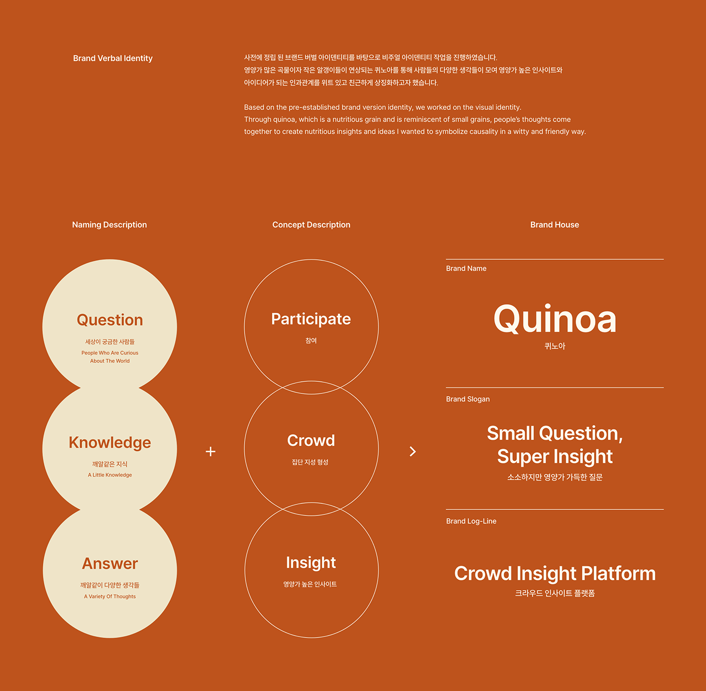
Quinoa는 사소한 질문들에도 많은 사람들이 모여 다수의 생각(의견)을 모으는 집단 지성 인사이트 서베이 플랫폼입니다.
통계적 방식을 통해 인사이트를 제공하는 양방향 오픈형 리서치 커뮤니티 플랫폼으로,
리서치를 어려워하는 일반인도 누구나 쉽게 질문하고 접할 수 있고, 궁금증에 대한 답을 얻을 수 있는 곳입니다.
기존 리서치(서베이) 업계의 폐쇄성과 일방향, 접근의 어려움 등을 깨기 위해 기존 리서치 브랜드와 경쟁이 아닌,
패널과 서베이 유저가 서로 상호 작용하는 형태로 기존 시장의 게임 체인저가 되어 비즈니스 판을 바꾸고자 합니다.
Quinoa is a two-way open research community platform that provides insight through statistical means
into the diverse ideas of anonymous people who are experienced in trivial questions.
It is a place where anyone who finds it difficult to research can easily ask and access questions and get answers to questions.
To break the closeness, one-way, and access difficulties of the existing research (survey) industry, we want to transform the business into a way that panels and survey users interact with each other, not competing with existing research brands.
Market Issue
기존 리서치 시장과 서베이 폴에서는 크게 3가지의 이슈가 있었습니다.
01. 주된 이용자는 전문가들이기에 일반인에게는 높은 진입장벽이 존재했습니다.
02. 응답자에게만 한정된 답변으로 인해 일방향성이 높았고, 원활한 커뮤니티를 생성하기에 어려움이 있었습니다.
03. 불편한 UI 및 유료 앱 중심으로 어려운 접근성을 가지고 있었습니다.
There were three main issues in the existing research market and survey poles.
01. The main users were experts, so there was a high entry barrier for the general public.
02. It was highly unidirectional due to the responses limited to respondents It was difficult to create a seamless community.
03. It had difficult accessibility focusing on uncomfortable UI and paid apps.

Project Goal
기존 리서치 시장의 한계점을 패널과 서베이 유저간 상호 작용하는 형태로써 비즈니스 판을 바꾸고자 합니다.
패널과 서베이 유저간 상호 작용하는 형태로써 지식과 정보를 자유롭게 주고받으며, 누구나 쉽게 접할 수 있는 오픈 리서치 플랫폼이 되고자 합니다.
Existing research market limitations between panel and survey users We want to change the business landscape in an interactive manner. It's a form of interaction between the panel and the survey user You can freely exchange knowledge and information It's easy for everyone to accessible to everyone I want to be an open research platform.

In-depth Interview
내부 기획자와 인터뷰이들은 아래와 같은 의견과 소구점을 지니고 있었습니다.
Internal planners and interviewers had the following opinions and points of appeal.


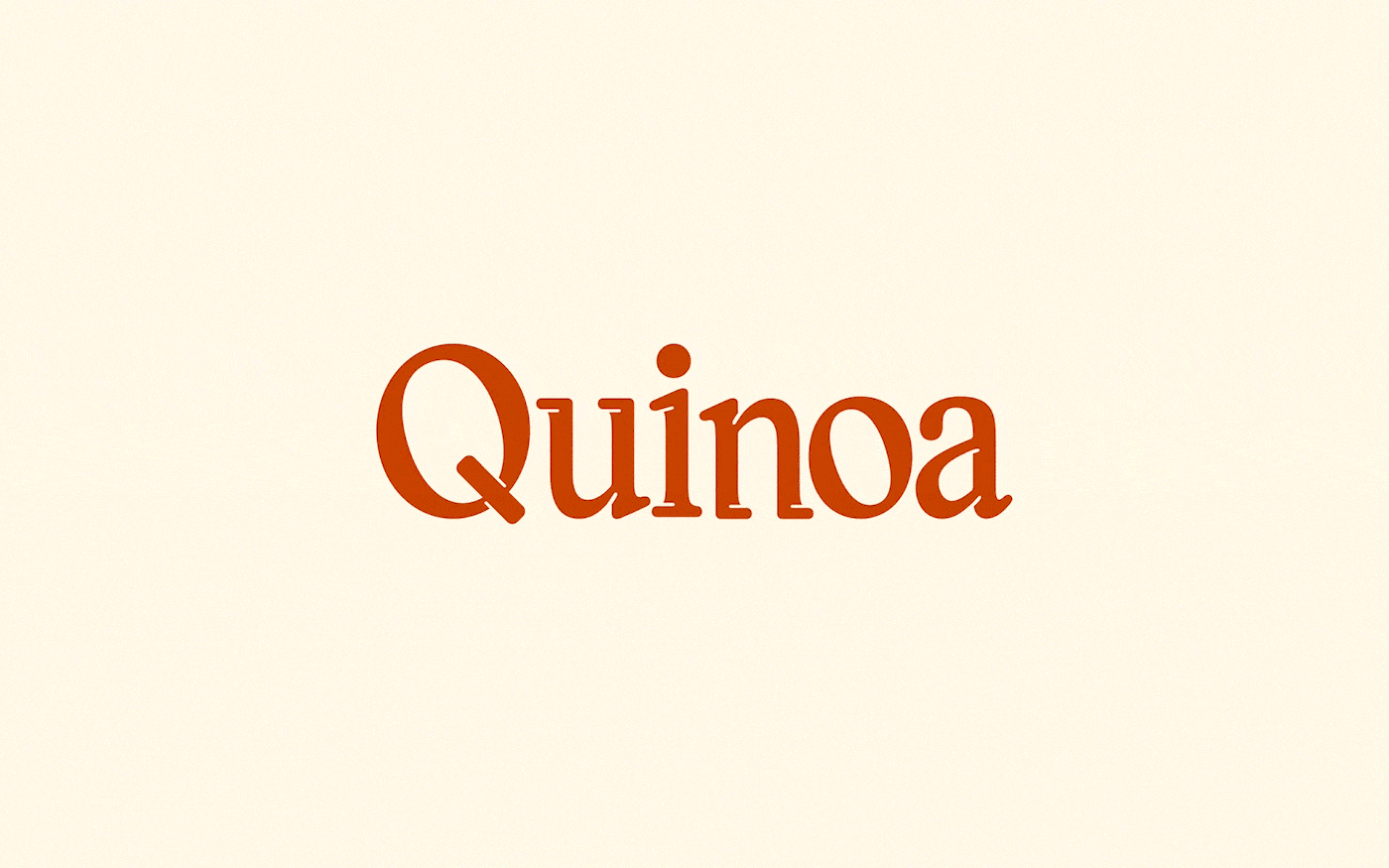
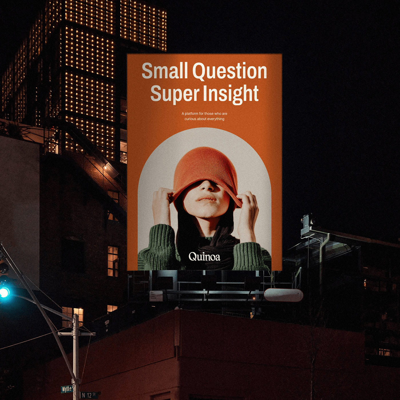
Brand Logo
Quinoa의 브랜드 로고는 글자의 가로폭이 좁은 'Condensed Type'의 'Round Serif ' 서체로 개발되어
전문가와 비전문가 모두가 쉽게 접근하고 이용하고자 하는 플랫폼의 모습을 담았습니다.
또한 알파벳 자체에 'Ink Trap' 효과를 적용하여 'Serif' 라는 클래식한 서체에서도 동적이고 위트있는 조형성을 갖추고 있으며,
이는 퀴노아라는 작은 알갱이들이 의문점 안으로 파고들어 다양한 인사이트를 찾아 나서는 서베이의 모습을 형상화한 로고입니다.
Quinoa’s brand logo has been developed in the narrow-width Condensed Type Round Serif font to capture the image of a platform that both professionals and non-experts want to easily access and use.
In addition, the alphabet itself has an Ink Trap effect, which is dynamic and witty in a classic frame called Serif, and it is a logo that embodies the survey of small grains called quinoa that digs into questions and finds various insights.


Graphic Motif System
그래픽 모티프는 Quinoa의 ‘i’에서 추출된 원의 형태를 기반으로 하되 메인으로 플레이 하는 앱 서비스(UI/UX)에서의
원활한 사용을 위해 반원형을 기본 메타포로 활용합니다. 원의 반지름(Y)에서 1/5 된 값(X)으로 Type A, B, C의 그래픽 모티프 규칙을 표현합니다.
원활한 사용을 위해 반원형을 기본 메타포로 활용합니다. 원의 반지름(Y)에서 1/5 된 값(X)으로 Type A, B, C의 그래픽 모티프 규칙을 표현합니다.
Graphic motifs are based on the form of circles extracted from Quinoa’s ‘I’ but use semicircles as default metaphors for smooth use in the main-play app service (UI/UX). Express the graphical motif rule of Type A, B, and C with a value (X) of 1/5 from the radius (Y) of the circle.


Brand Color
브랜드의 메인 컬러는 퀴노아의 품종 중 가장 고단백 품종으로 알려진 Red Quinoa에서 추출하여, 영양가 높은 인사이트를 상징합니다.
세컨더리 컬러는 백그라운드에서 적극적인 사용성을 위해 Warm & Cool 톤의 그레이 스케일을 White Quinoa와 Black Quinoa 품종에서
추출하여 지정했습니다.
The brand's main color is derived from Red Quinoa, known as the most high-protein variety of quinoa,
and represents a nutritious insight. For active usability in the background, the secondary color was specified by extracting the warm & cool tone grayscale from the White Quinoa and Black Quinoa varieties.


Typography
Archivo Condensed는 서체의 글리프와 종횡의 대비가 워드마크와 유사한 조형적인 특징을 가진 서체로
명확하고 심플한 형태를 가져 온/오프라인 환경에서 가독성이 우수한 영문 서체입니다.
정보 전달을 우선시하는 바디카피 서체로는 다양한 굵기를 지원하는 Inter 영문 서체와
UX/UI에 특장점을 가진 Suit 국문 서체를 활용해 App에서의 활용성을 우선시하여 지정합니다.
Archivo Condensed is a typeface with a formative characteristic similar to the word mark in the glyph
and aspect of the typeface, and is a highly readable English font in a clear and simple form/offline environment.
Body copy typeface that prioritizes information transfer is designated by prioritizing application utilization
by using Inter typeface that supports various thicknesses and Suit typeface that features UX/UI.

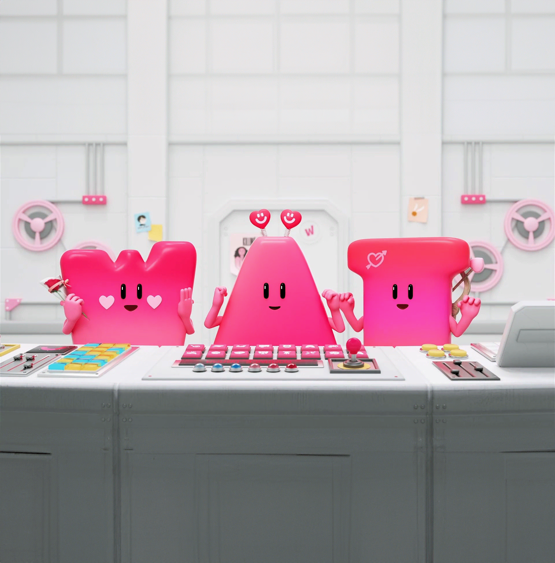
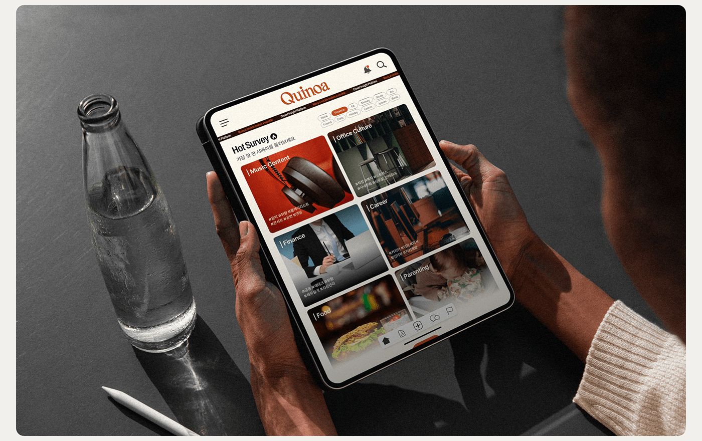
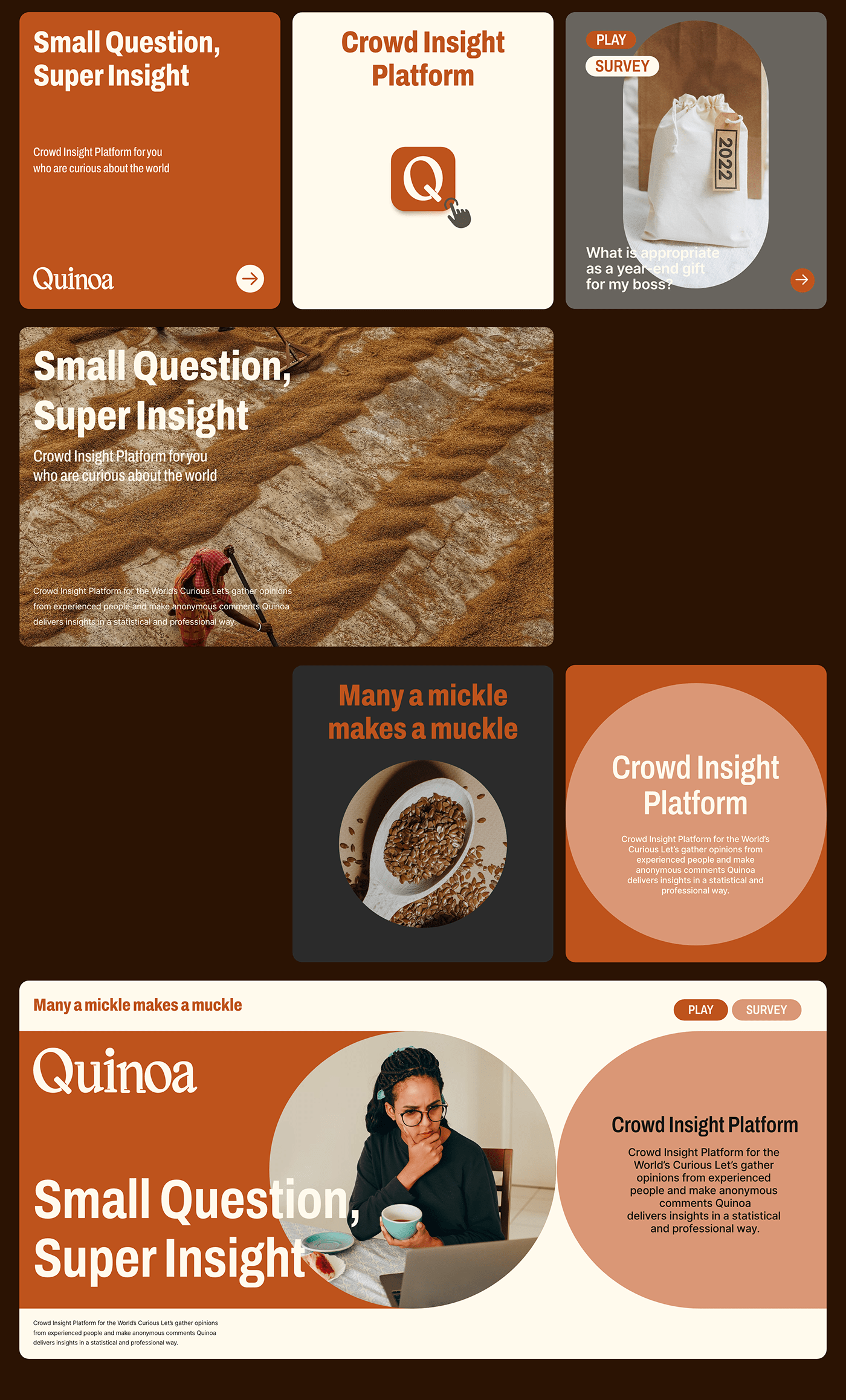
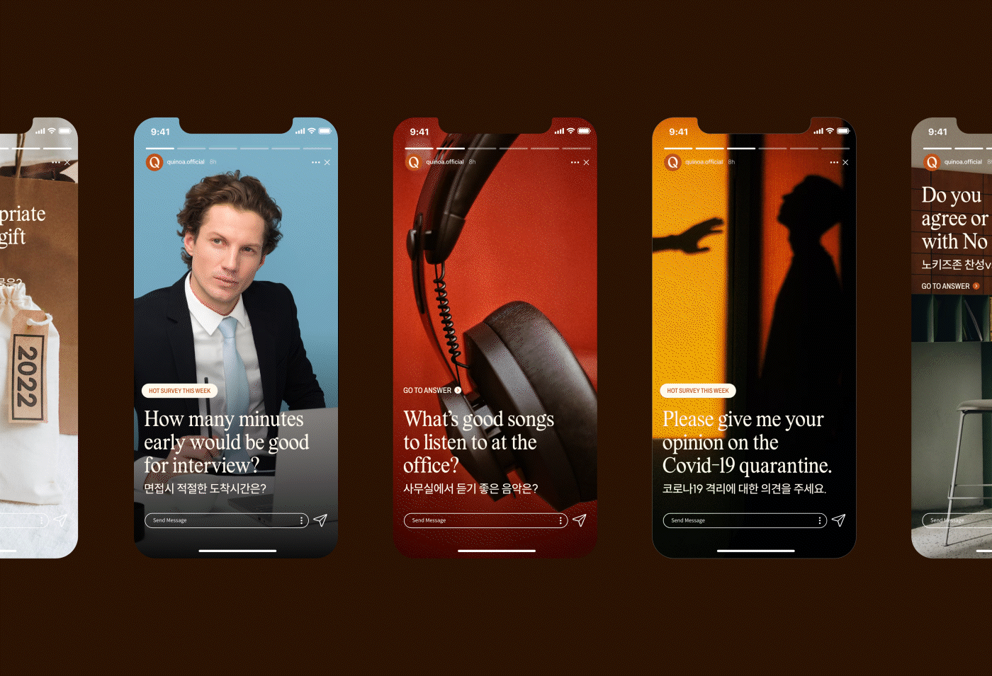
Application Design
Quinoa의 어플리케이션 디자인은 브랜드와 대중이 만나는 가장 직접적인 접점으로 앞서 정의한
브랜드의 그래픽 모티프를 활용하여, 앱의 스플래쉬 모션과 온라인 내의 다양한 인포그래픽 및 비주얼 등을 개발했습니다.
오프라인에서 활용 되는 다양한 어플리케이션들은 서비스에 대한 간결한 메시지와 로고 플레이를 통해 브랜드가 추구하는
톤앤매너에 맞춰 커뮤니케이션 합니다.
Quinoa's application design is the most direct contact point between the brand and the public.
The brand's graphic motif was defined earlier to develop the app's online splash motion and various infographics and visuals.
Various applications used offline communication with the tone and manner pursued by the brand through simple messages about the service and logo play.


LG CNS Inc.
Quinoa® Brand identity development
Quinoa® Brand identity development
LG CNS
E-Commerce Insight Team
Data Science Pro : Yoo Minjeung
Data Science Pro : Kwon Najin
TOMNICK ®
Strategy Director : Kim Dongwan [Tom]
Creative Director : Hong Hyundoo [Nick]
BX Designer : Hwang Sunwook [Sun] / Lee Hyeju [Zoey] / Jung Jiyoon [Sunny]
Strategy Director : Kim Dongwan [Tom]
Creative Director : Hong Hyundoo [Nick]
BX Designer : Hwang Sunwook [Sun] / Lee Hyeju [Zoey] / Jung Jiyoon [Sunny]
©2021. Tomnick Inc. all rights reserved.


